

I started with a sketch, creating a type loockup. The client wanted the lettering to be fun and playful, somewhat resembling 'soft serve'
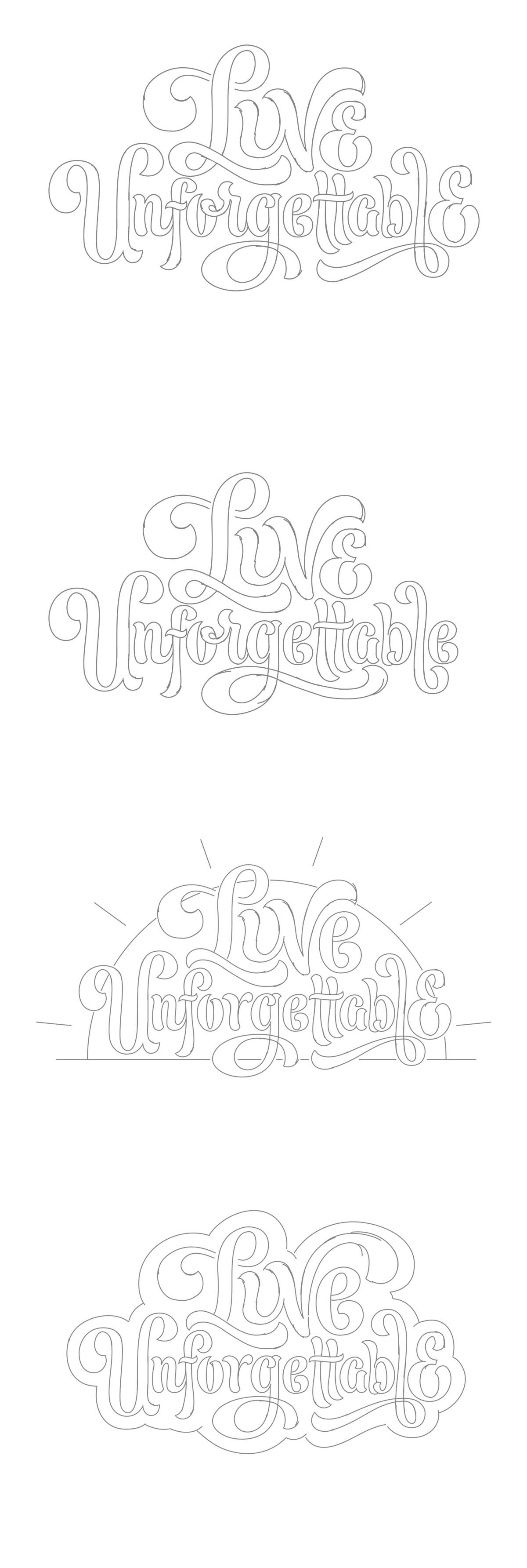
Some more early exploration of shapes and ideas.
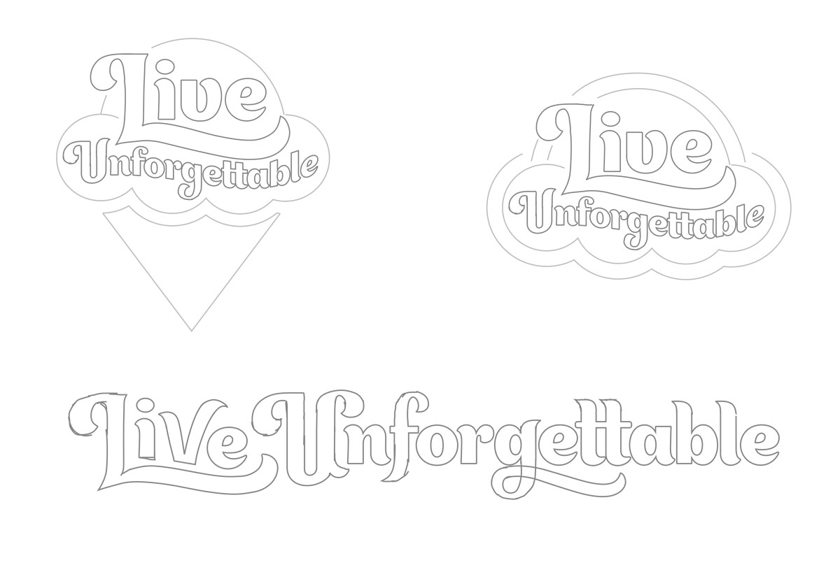
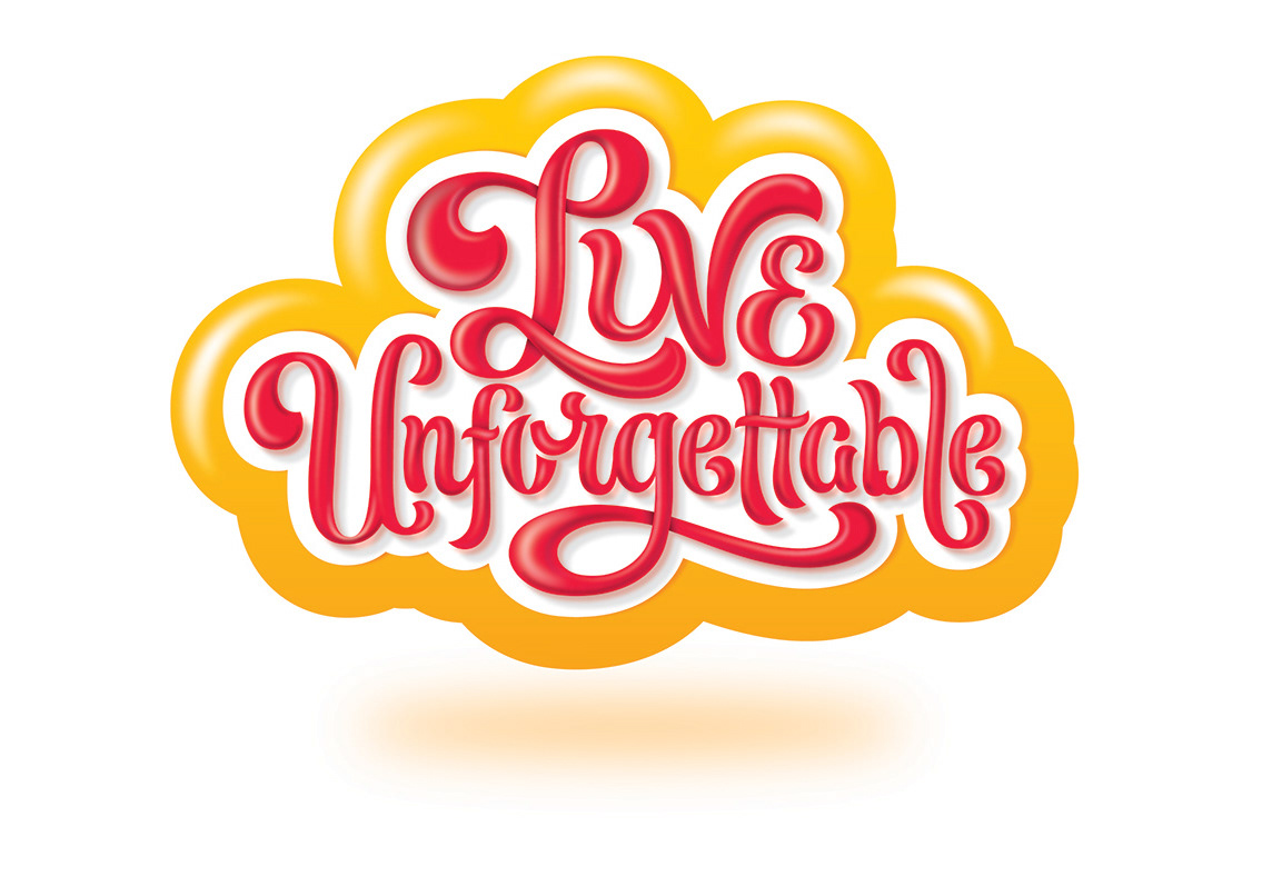
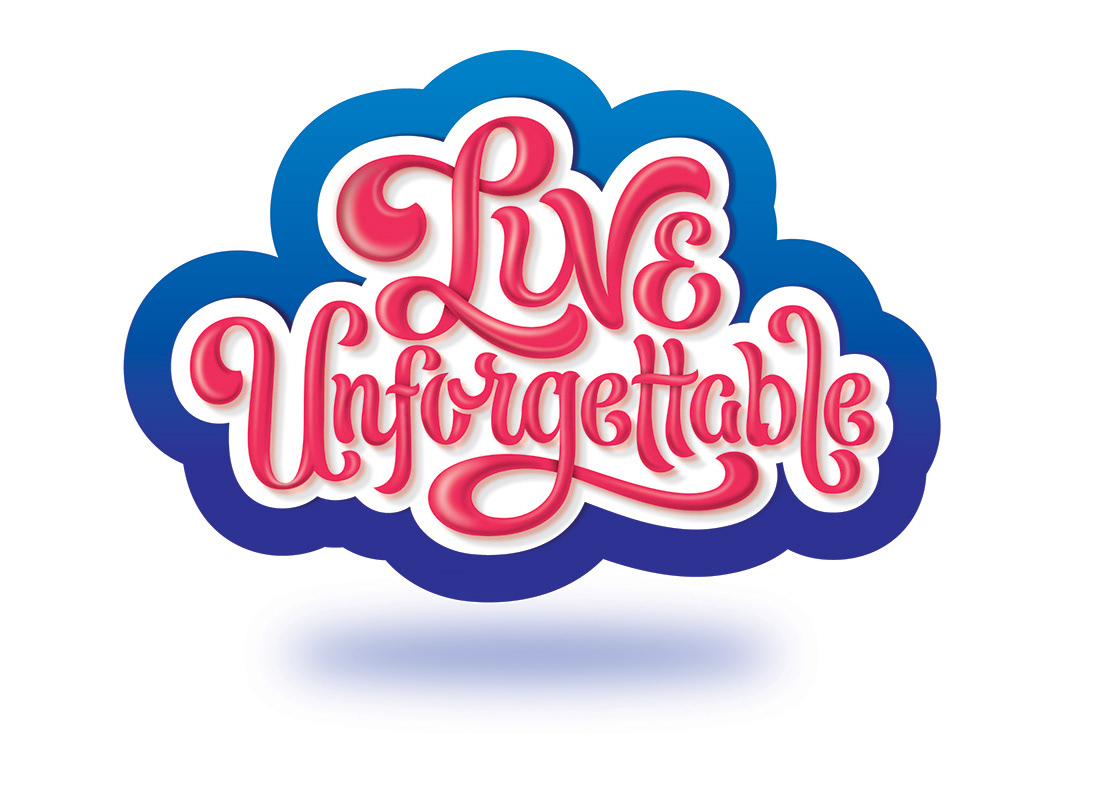
I ended up with lots and lots of colour and shape variations. All the way from simple flat design to more detailed 3d letters.
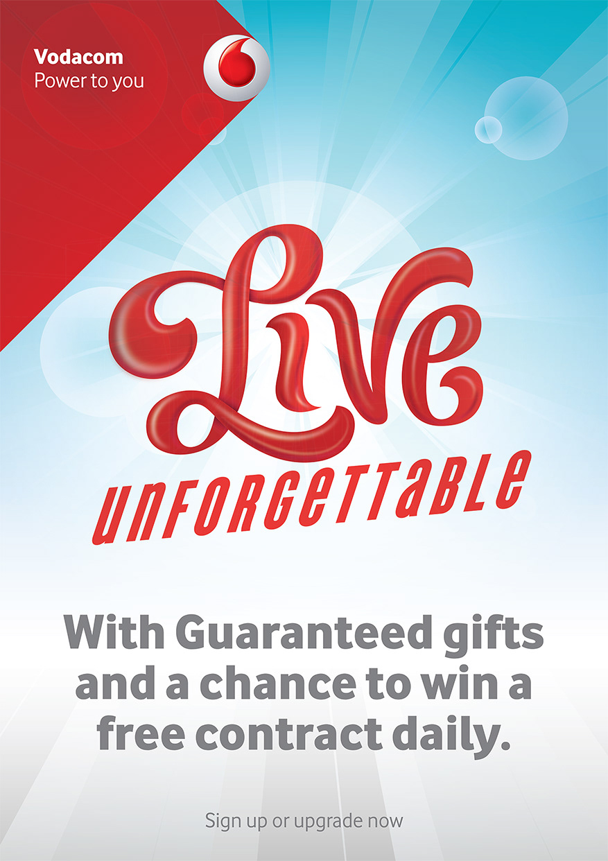
After many rounds of back and forth, the project then went in a different direction and what follows are a few variations and explorations.
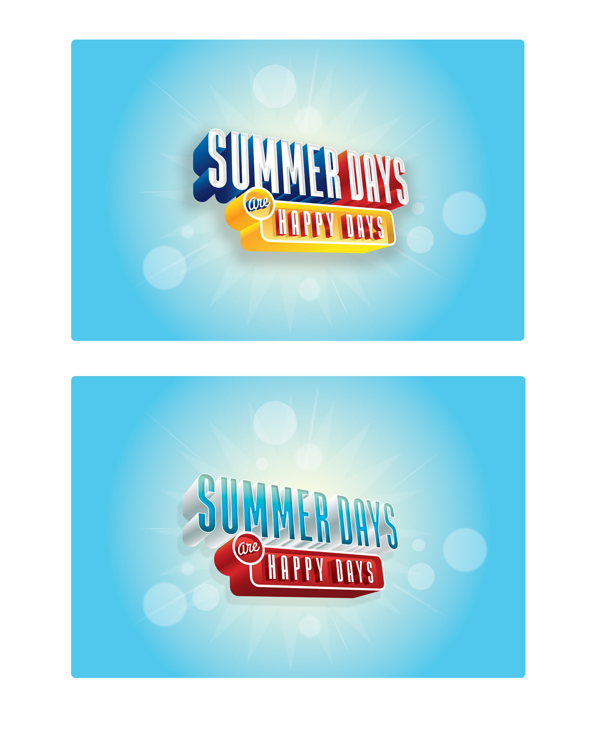
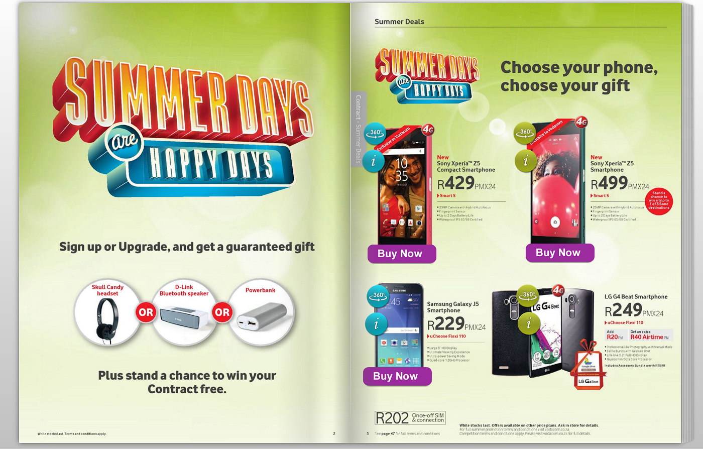
After many revisions and variations "Live Unforgettable" was scrapped and the wording
was changed to "Summer days are happy days"
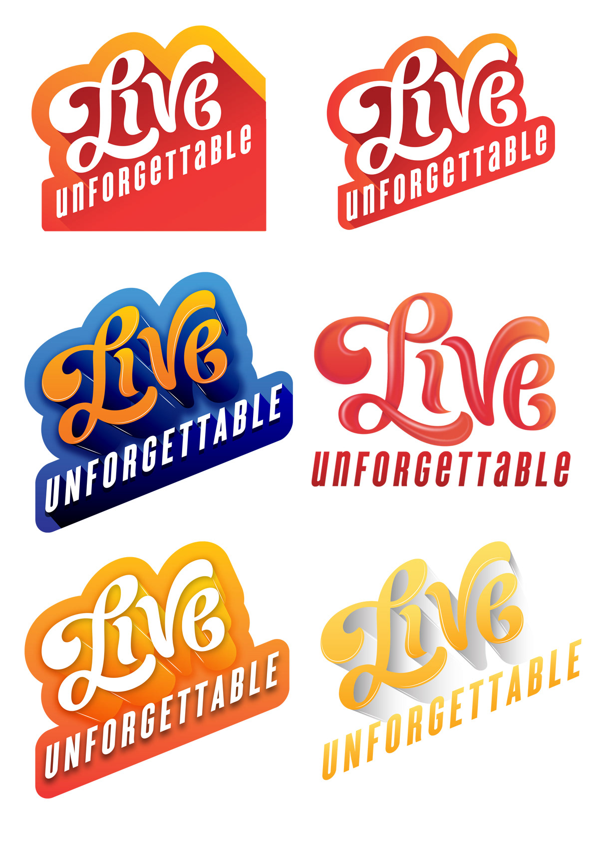
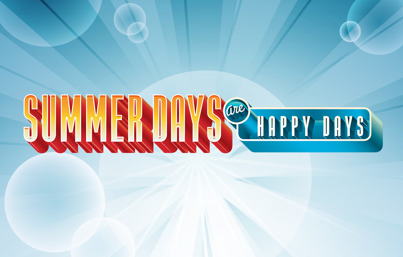
We then went through various rounds of colour variations, and also creating a linear as well a vertical device.
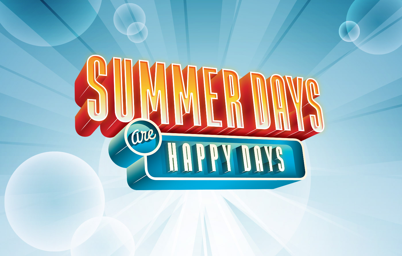
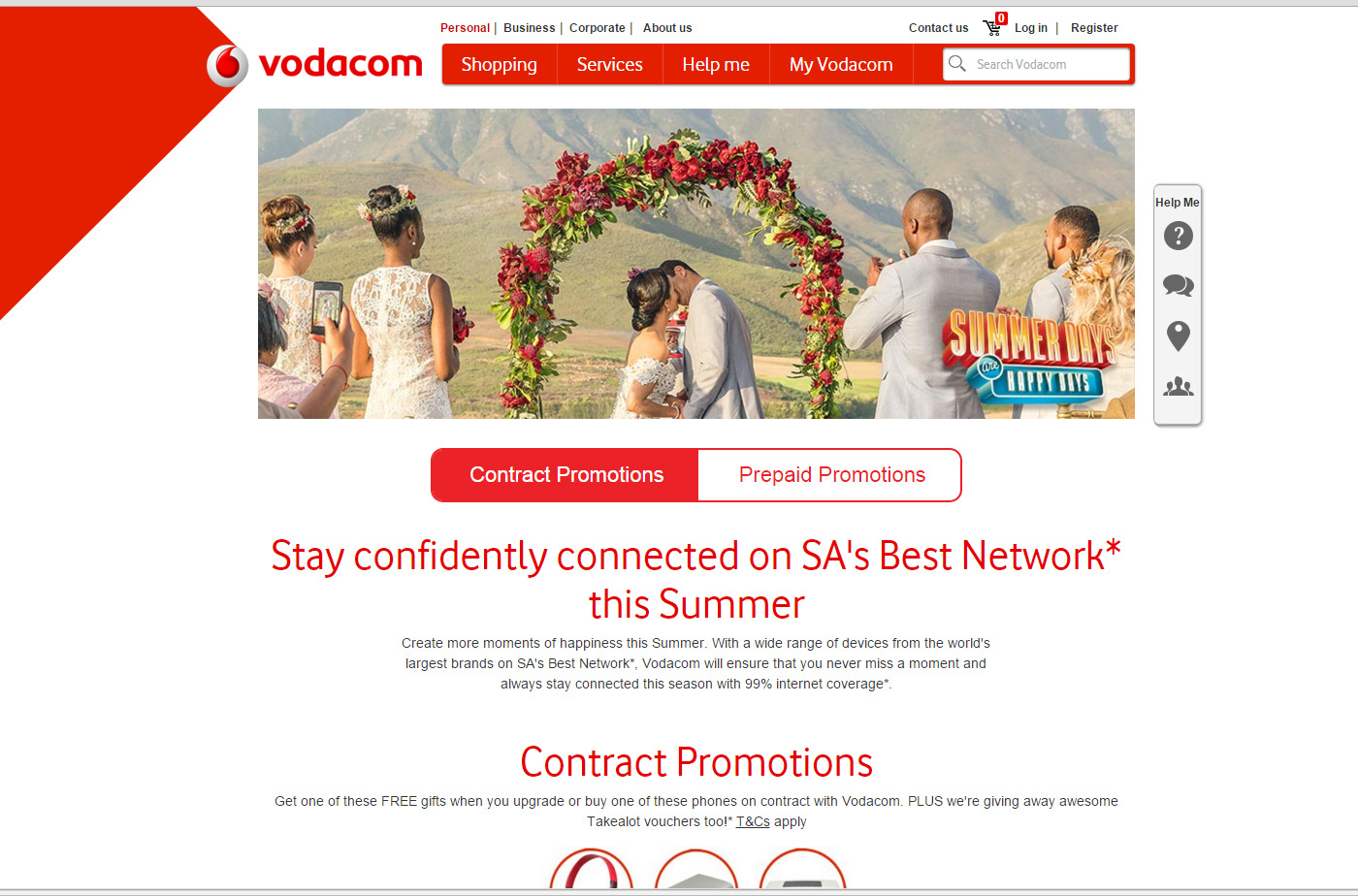
This was the final device chosen by the agency I was working with.
Thank you!