The strategy behind the branding was to create a fun identity that the community could rally behind and to encourage new members to join and get involved, fostering a close community through organized events.
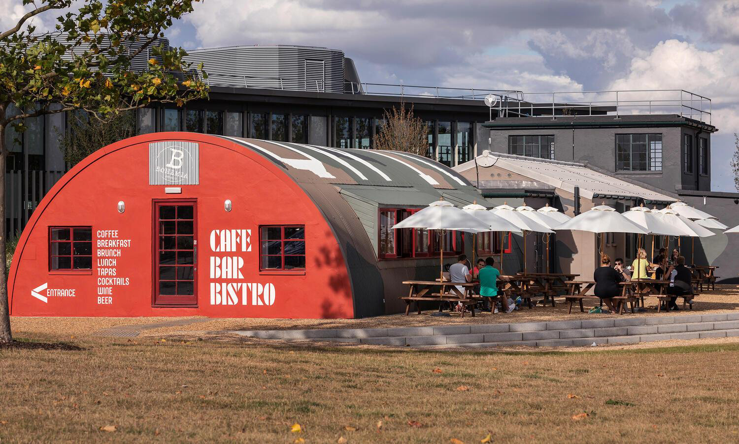
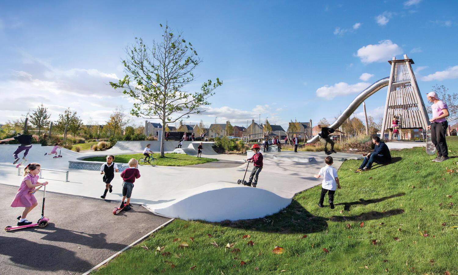

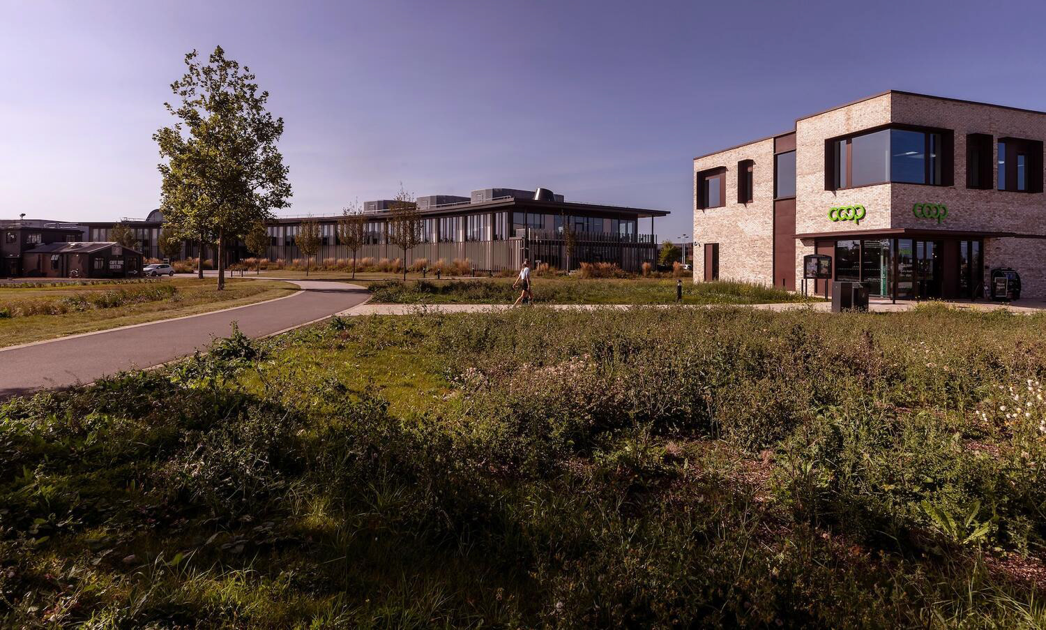
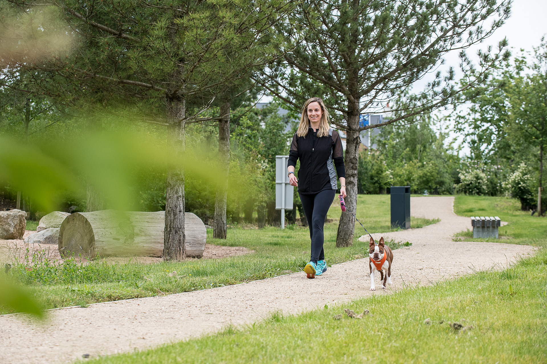
The abstract symbol is representative of the lifestyle and culture within the estate. It's a symbol that aims to represent the community as a whole and create unity.

