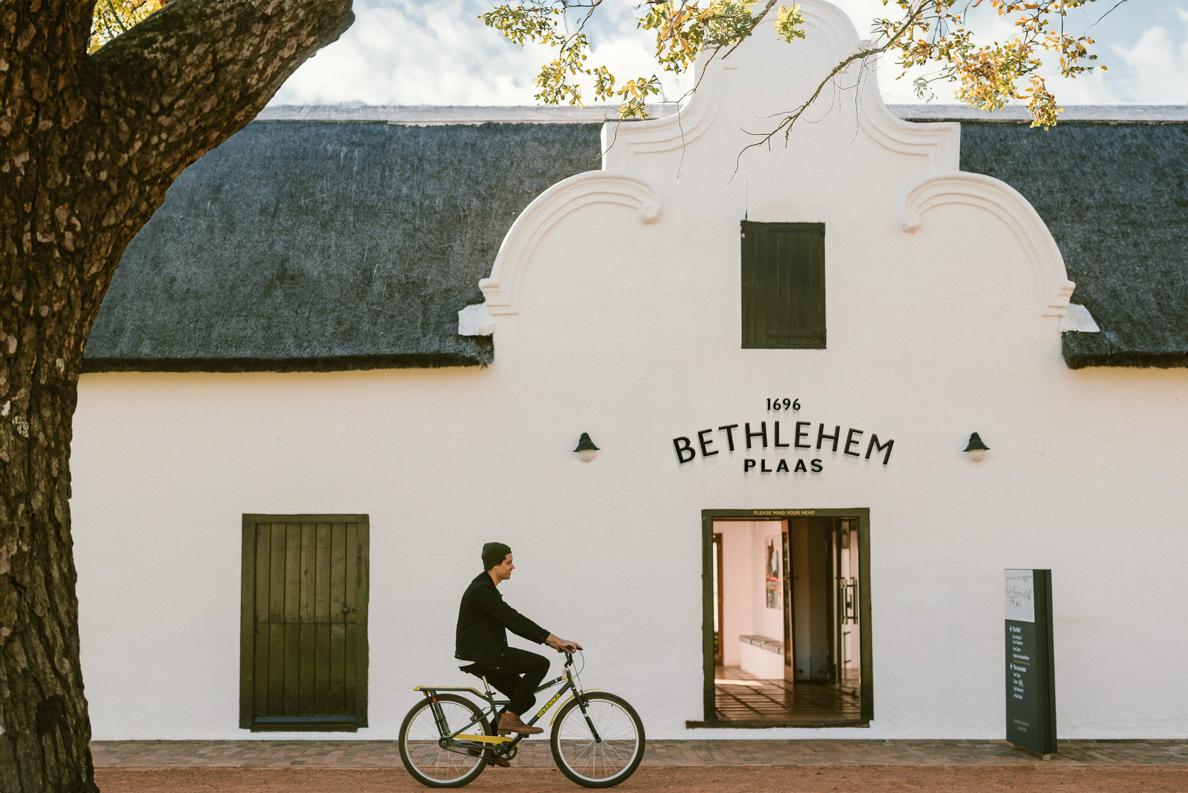
Client: Bethlehem Plaas
Category: Brand Identity, Illustration, Type Design
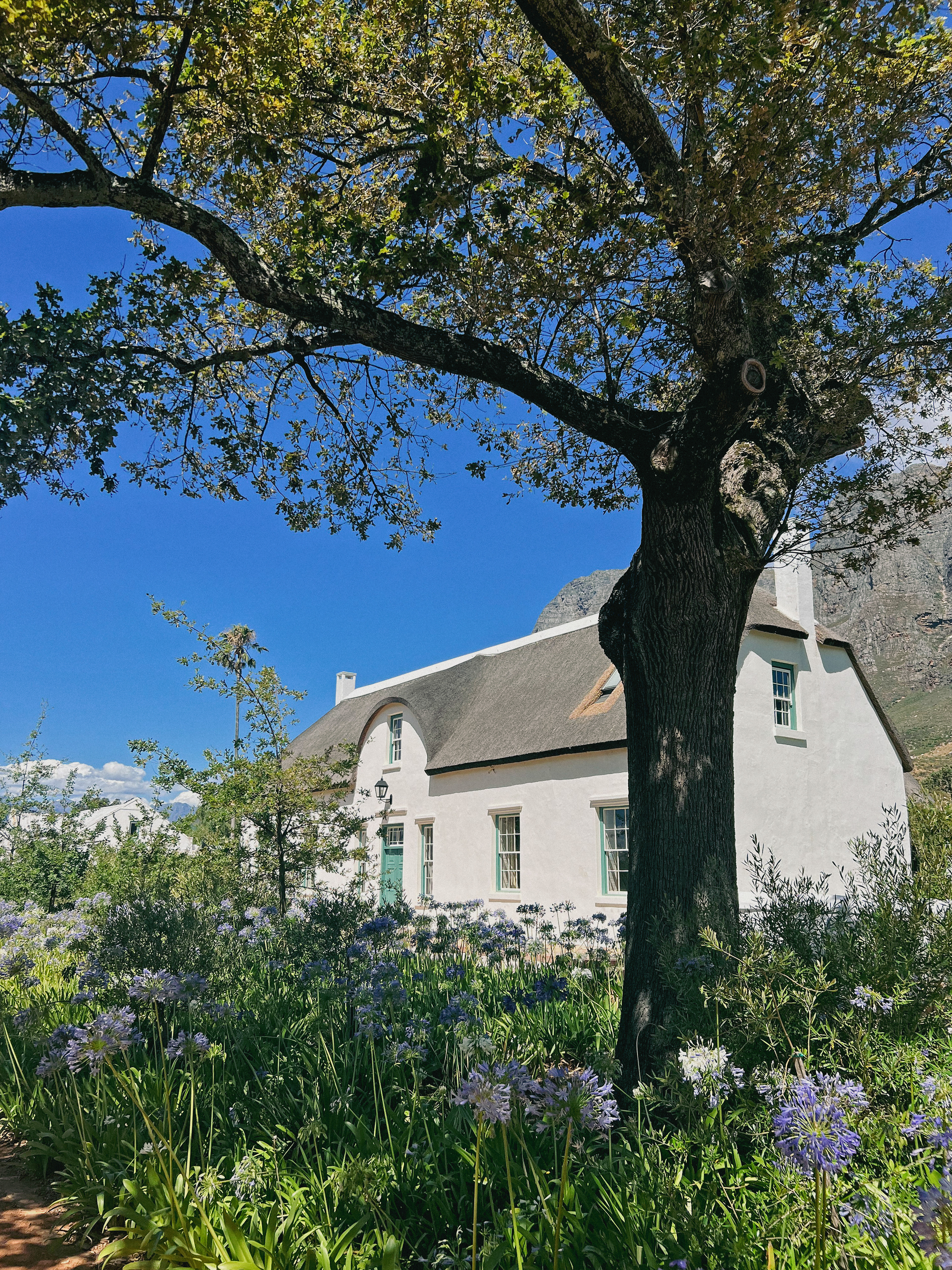
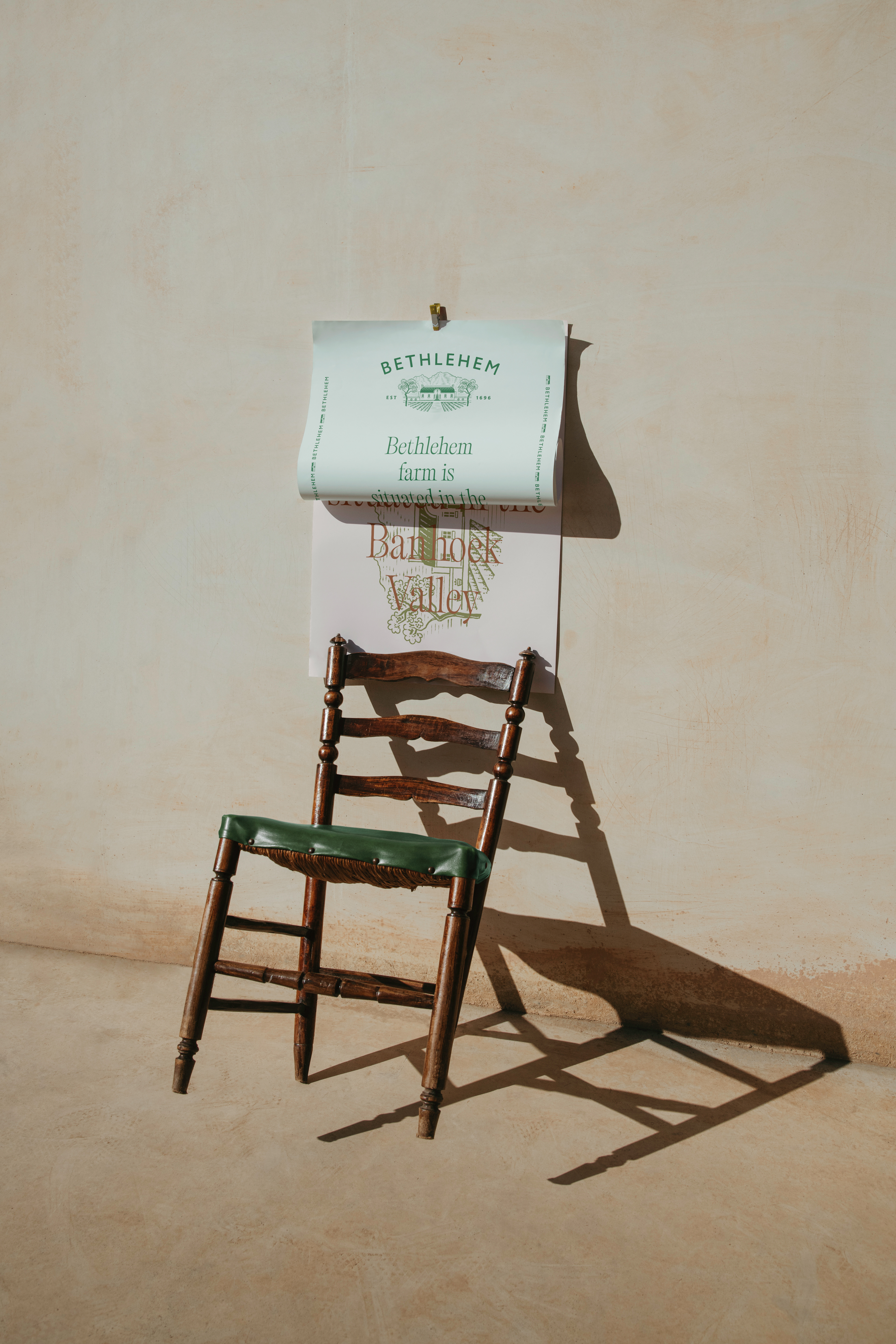
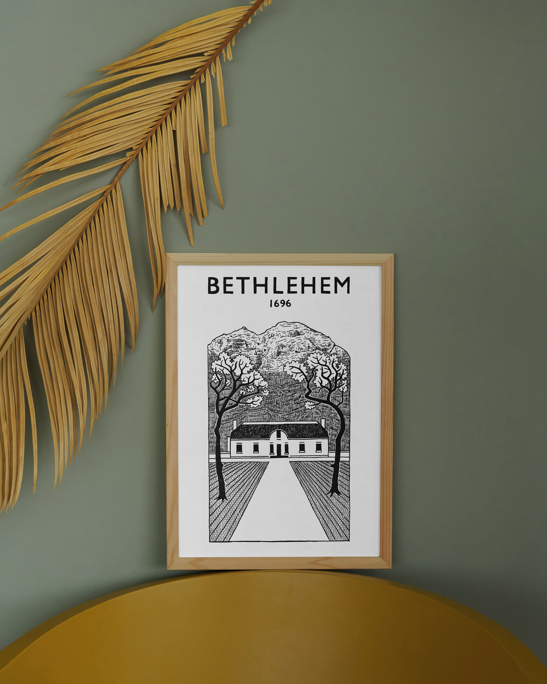
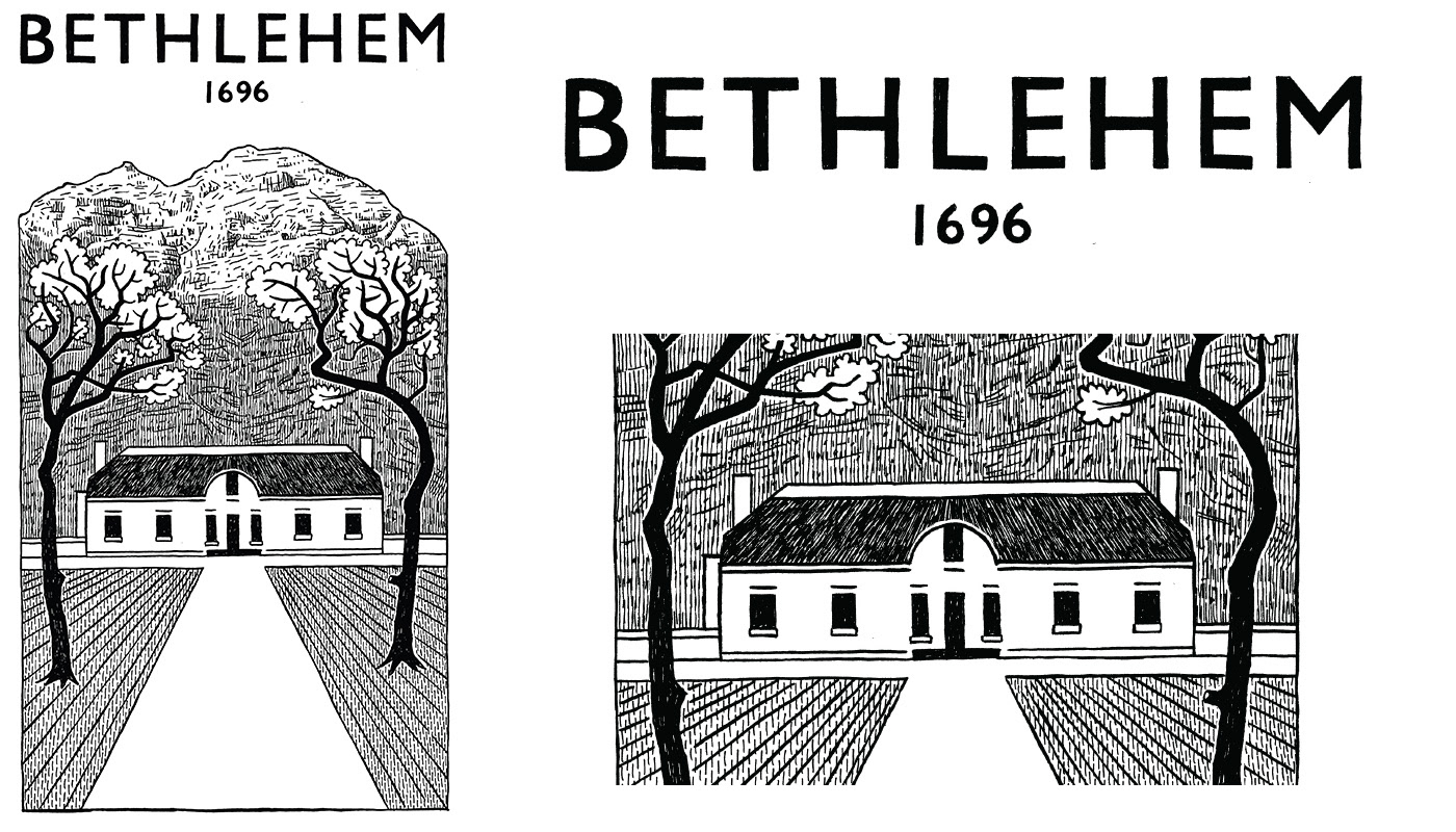
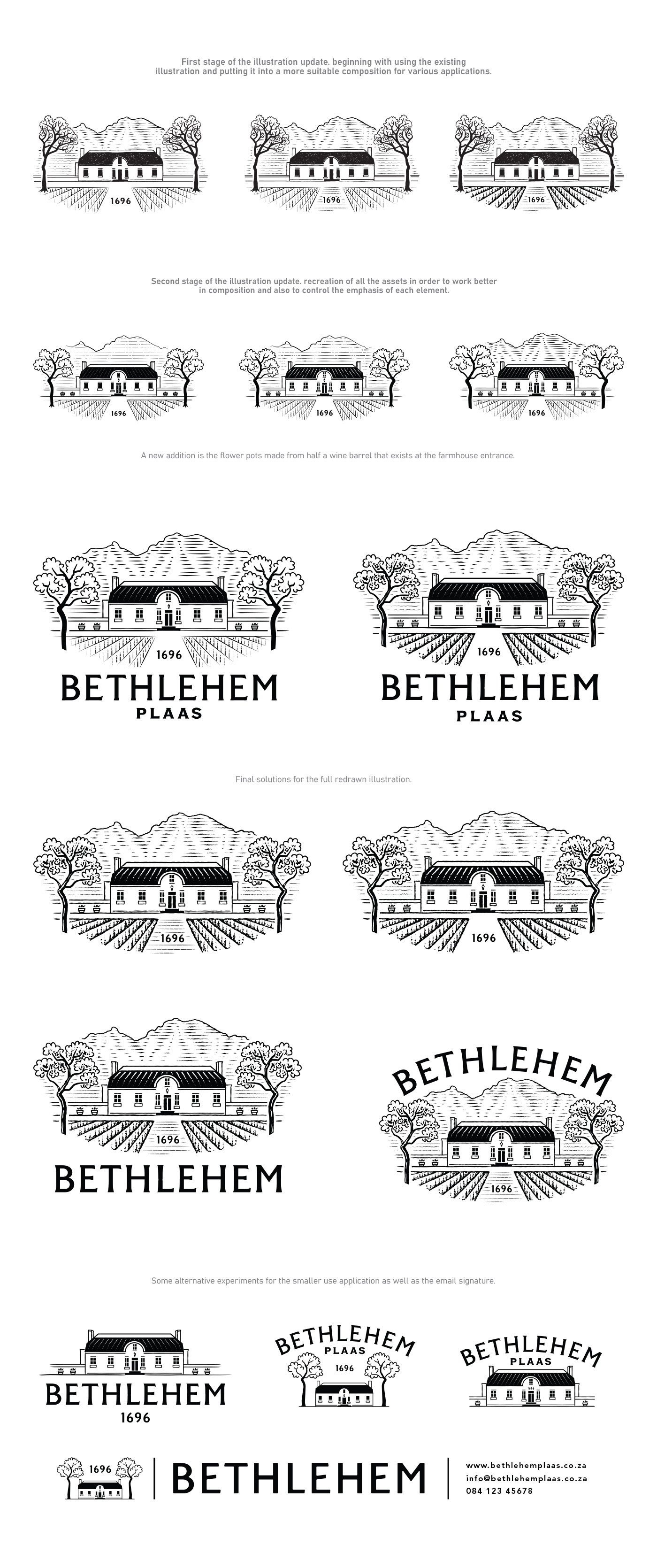
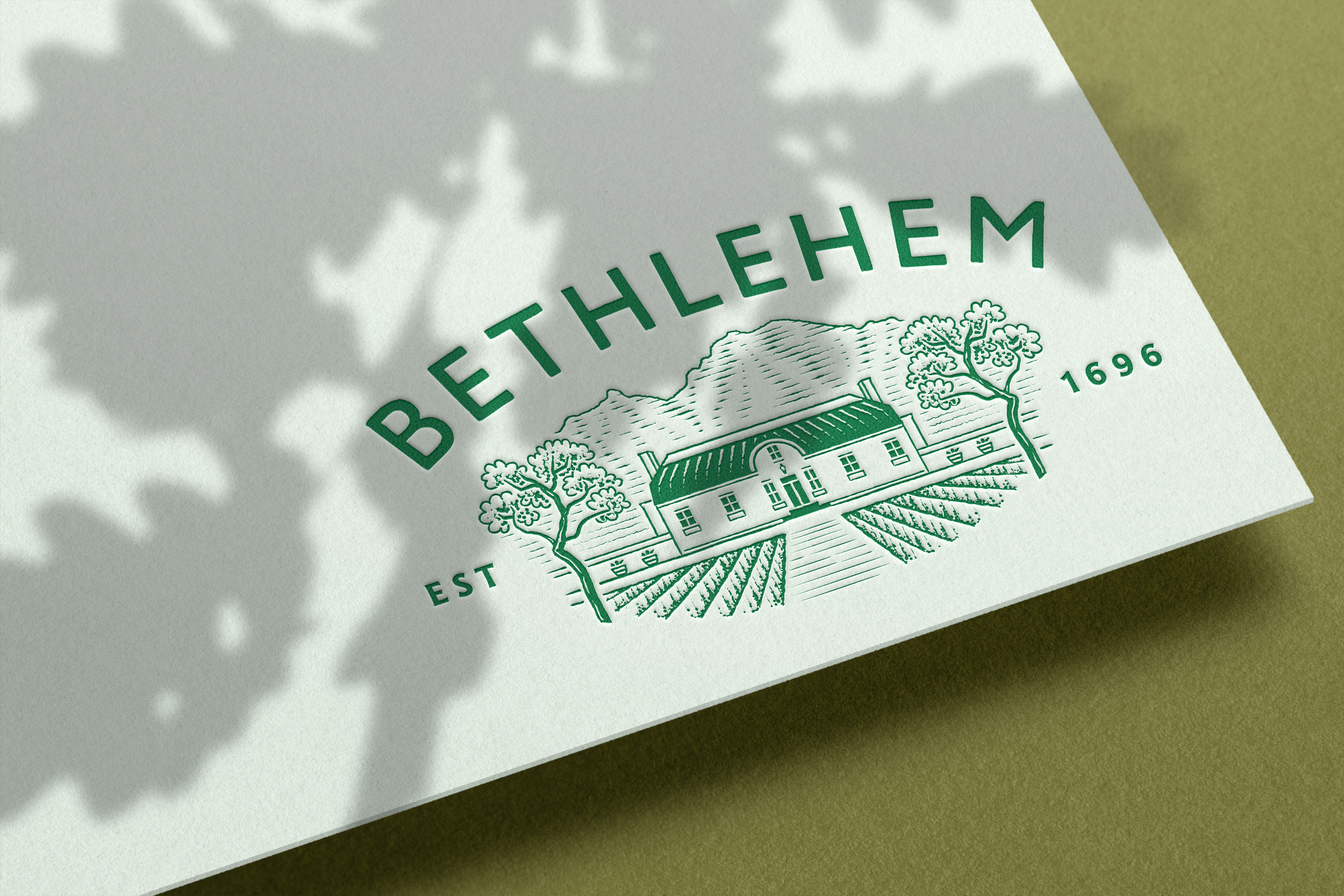
This logo update/refresh references the stylized illustration drawn by well-known South African illustrator Anton Kannemeyer. The illustration depicts the front of the manor house on the farm with the 2 iconic oak trees on either side. Anton is a close friend of the farm owner.
The owners wanted to keep the essence of this illustration alive in the logo update. Great care was taken to be as sensitive as possible to keep the same personality and intent of the original illustration.
Adjustments and improvements were suggested to provide the best usage and longevity of the logo.
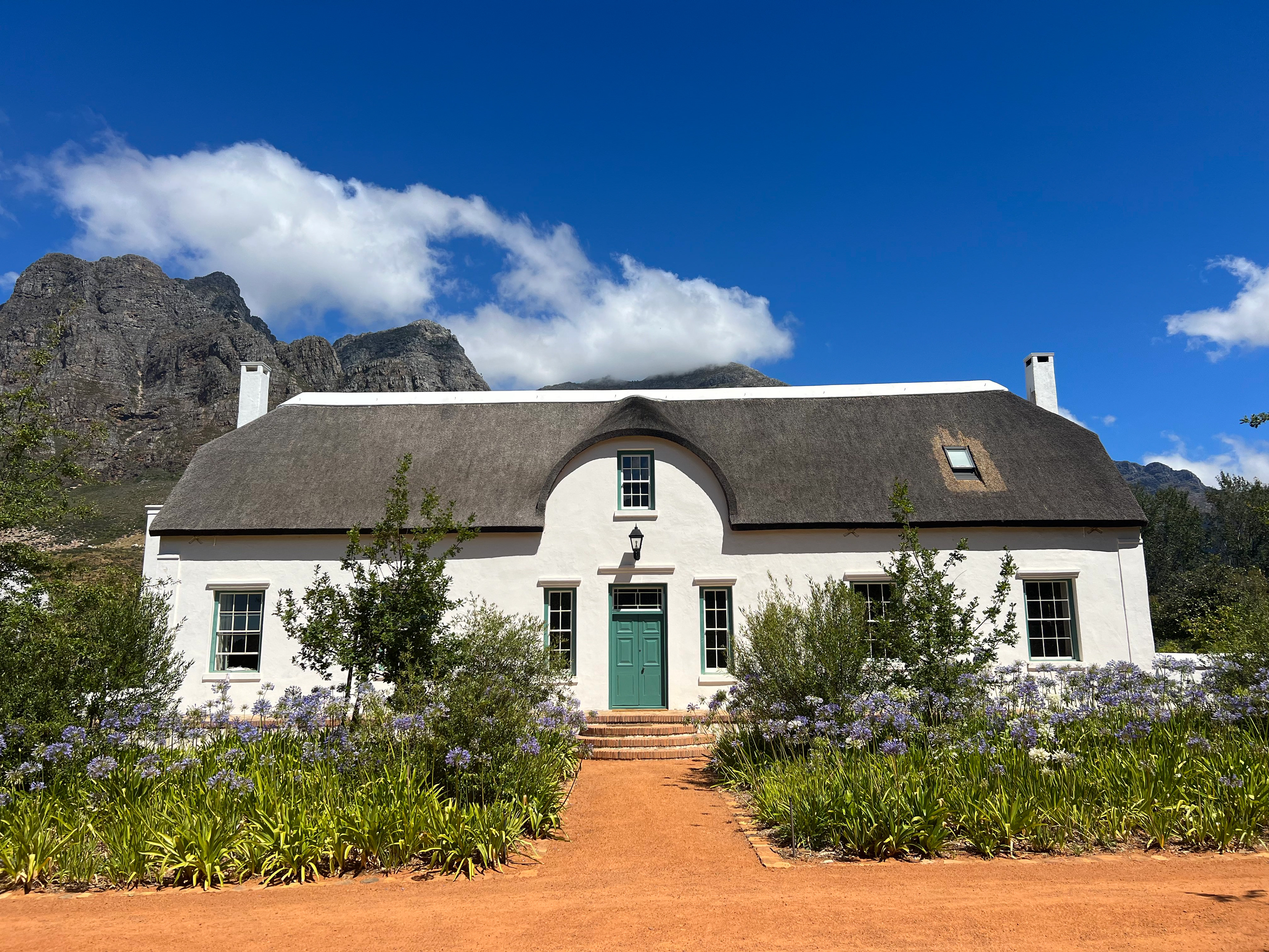
Bethlehem Plaas manor house
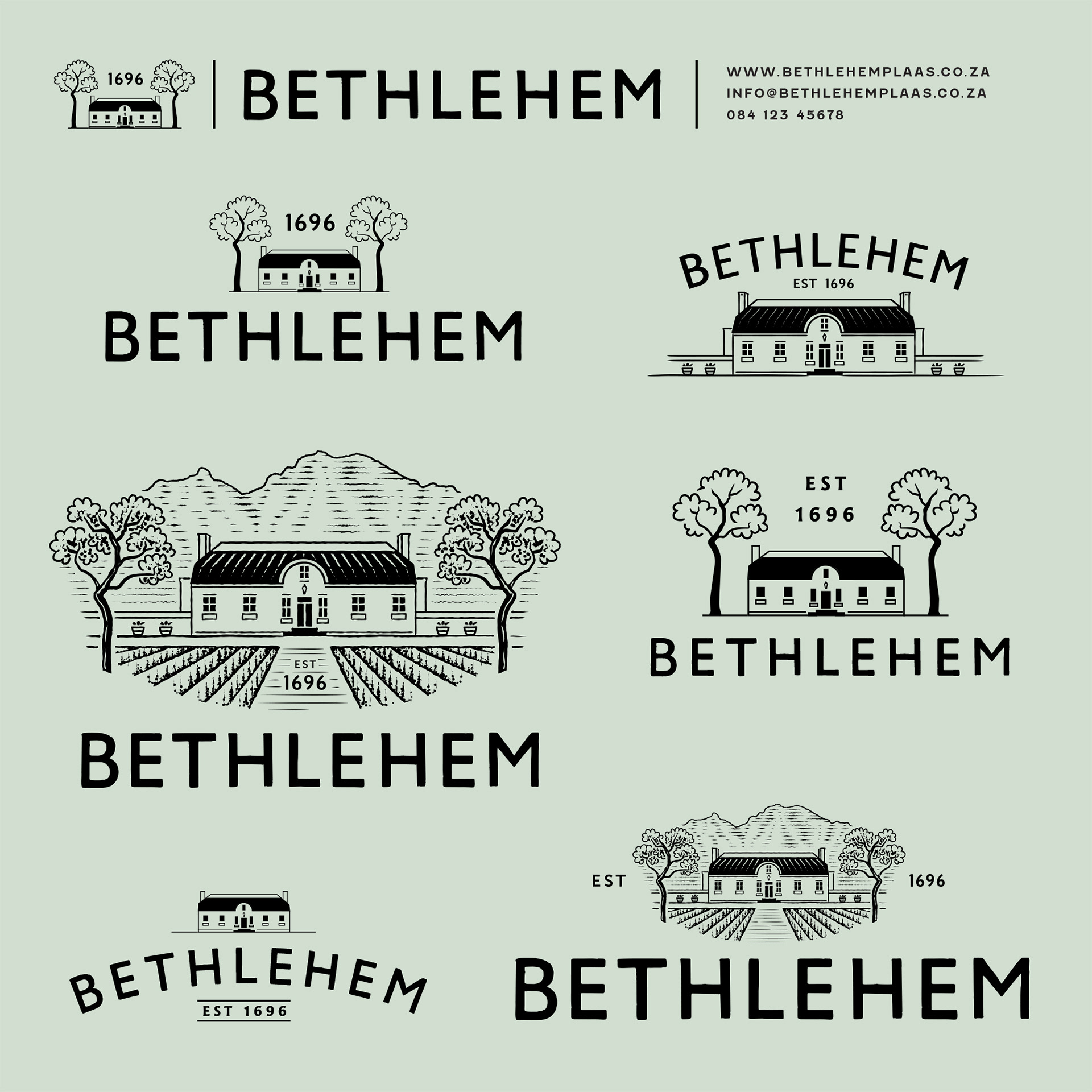
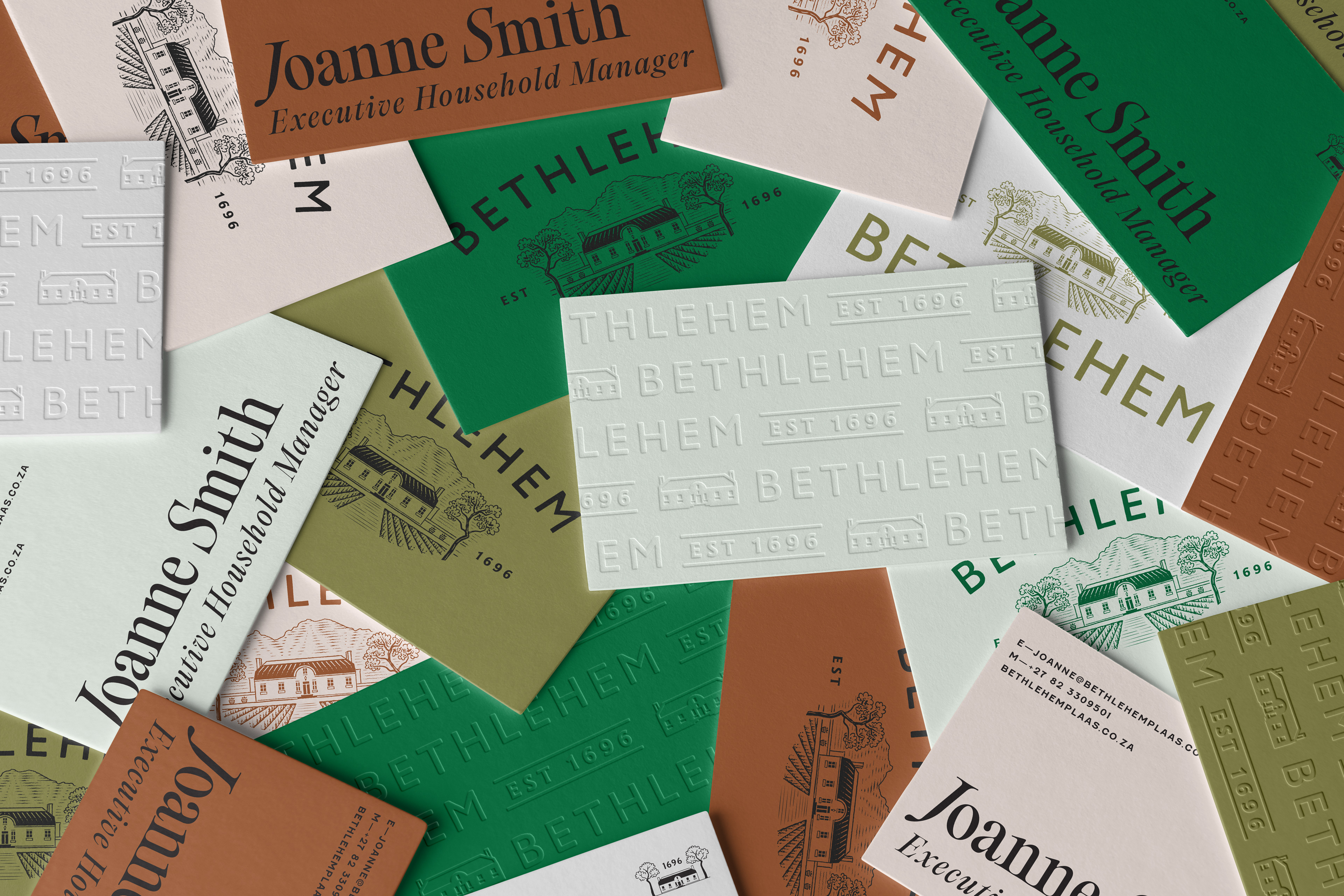
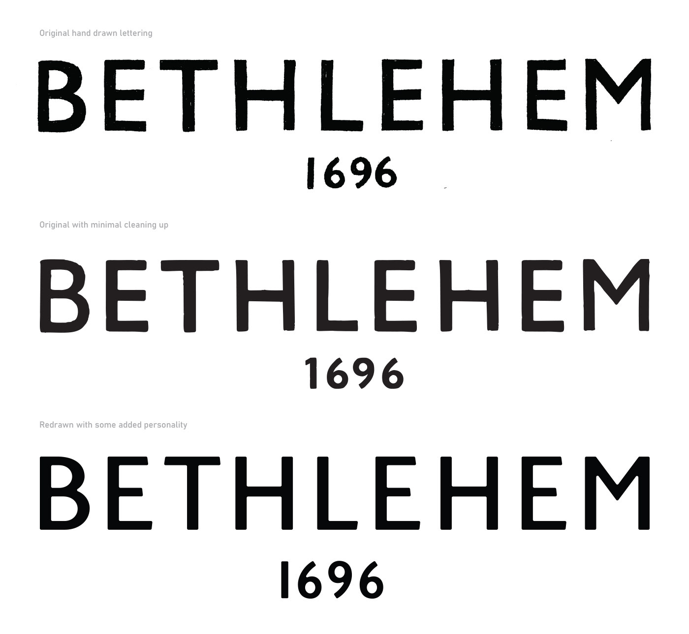
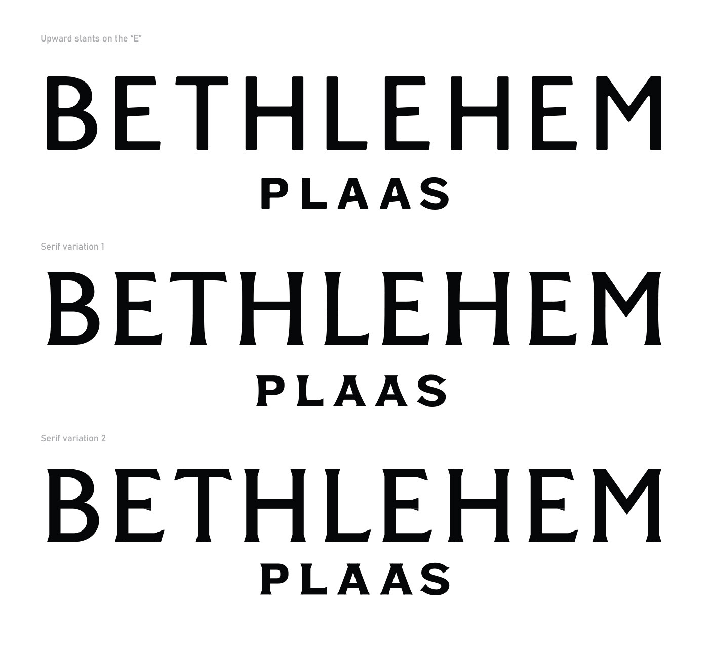
Attempting to stay as close to the original artwork as possible, I took the typography through a series of changes, beginning with very minimal cleanup and ending with more stylized serif options, all based on the original hand lettering.
A similar approach was used for the illustration. Beginning with minimal adjustments and then slowly adding more stylized elements and some extra tweaks to make things work better overall.
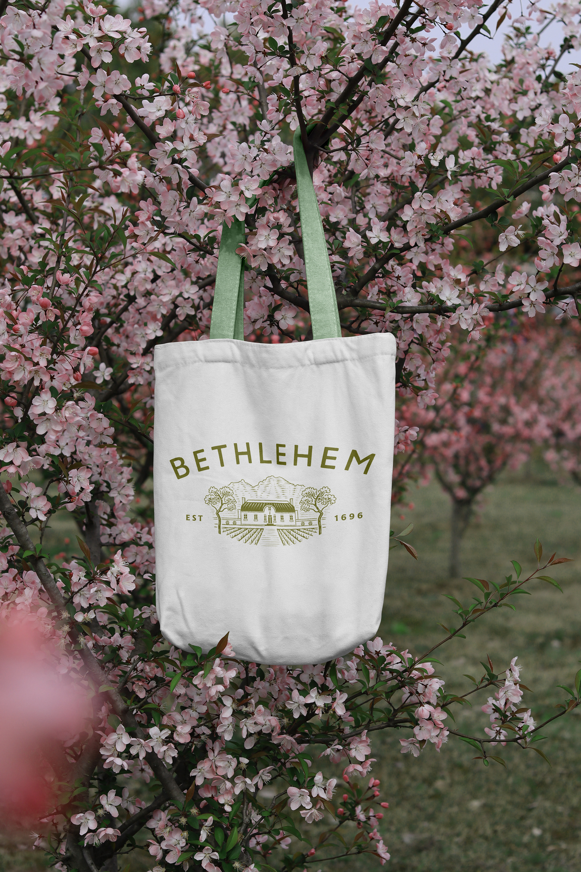
One of the requests was that the logo work in an oval shape but still be able to capture the vineyards and mountains behind the house.
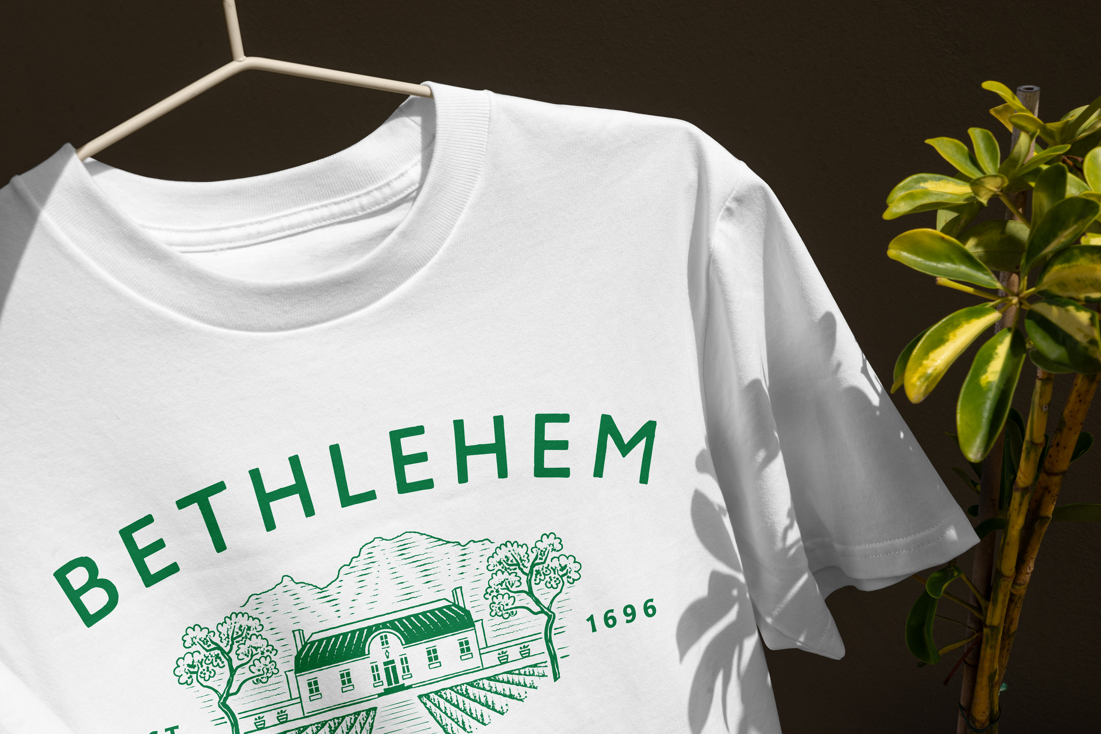
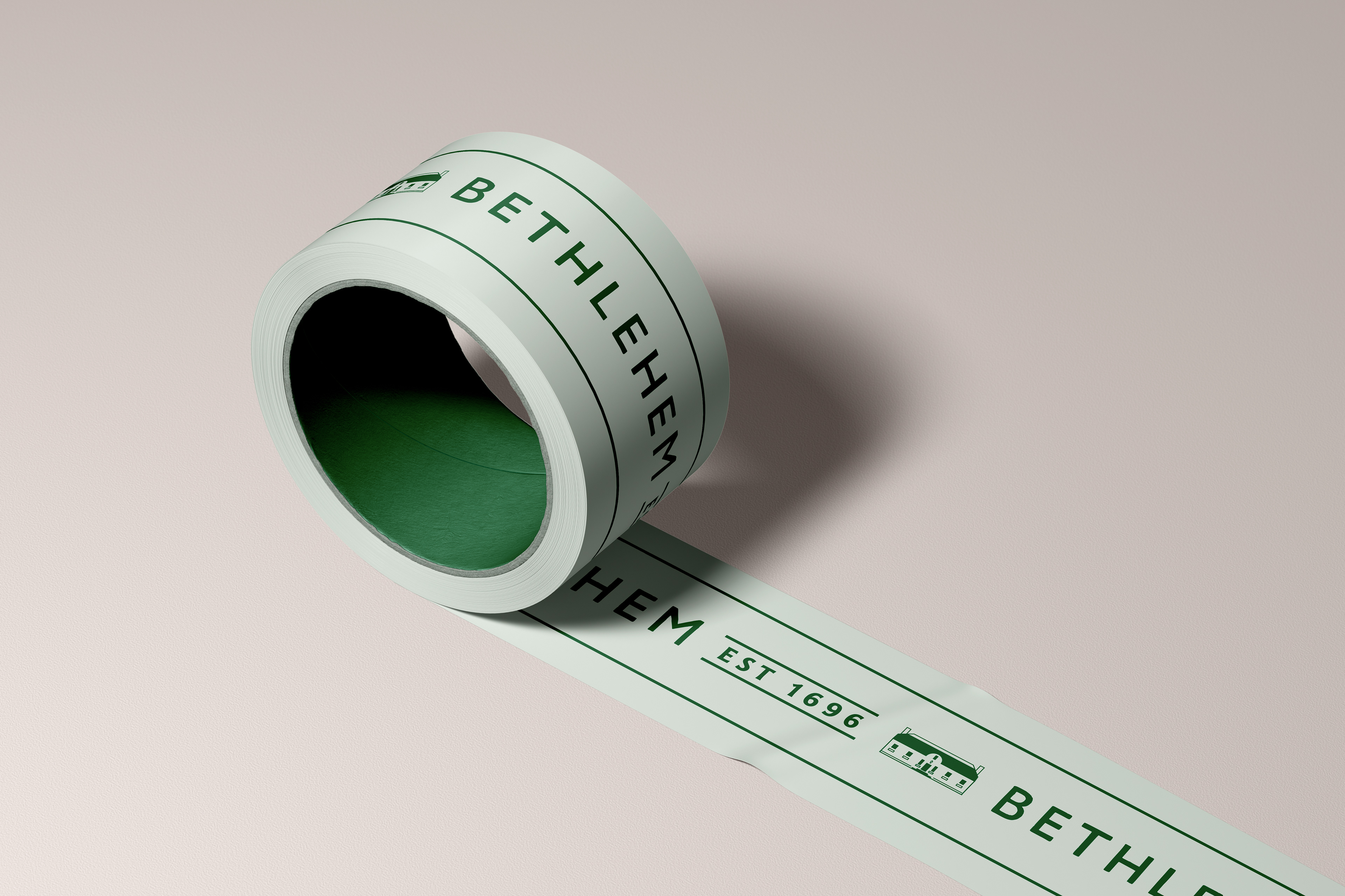
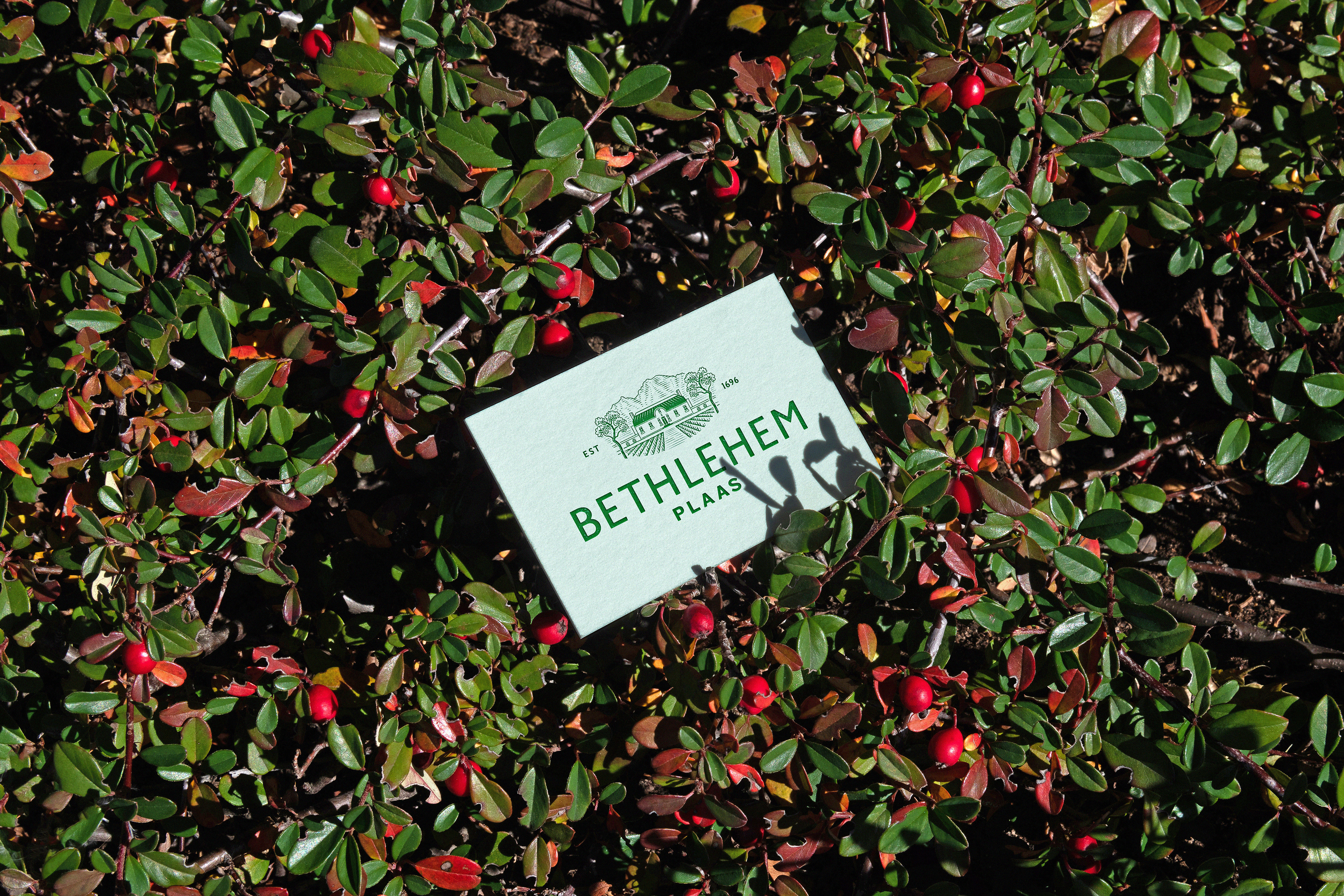
The logo would need to be versatile enough so that it can be embroidered on uniforms etc. A variety of smaller use icons were also developed for use in smaller applications such as social media icons and email signatures.