Client: Vandenberg
Agency: Co-Partnership
Category: Type Design, Packaging
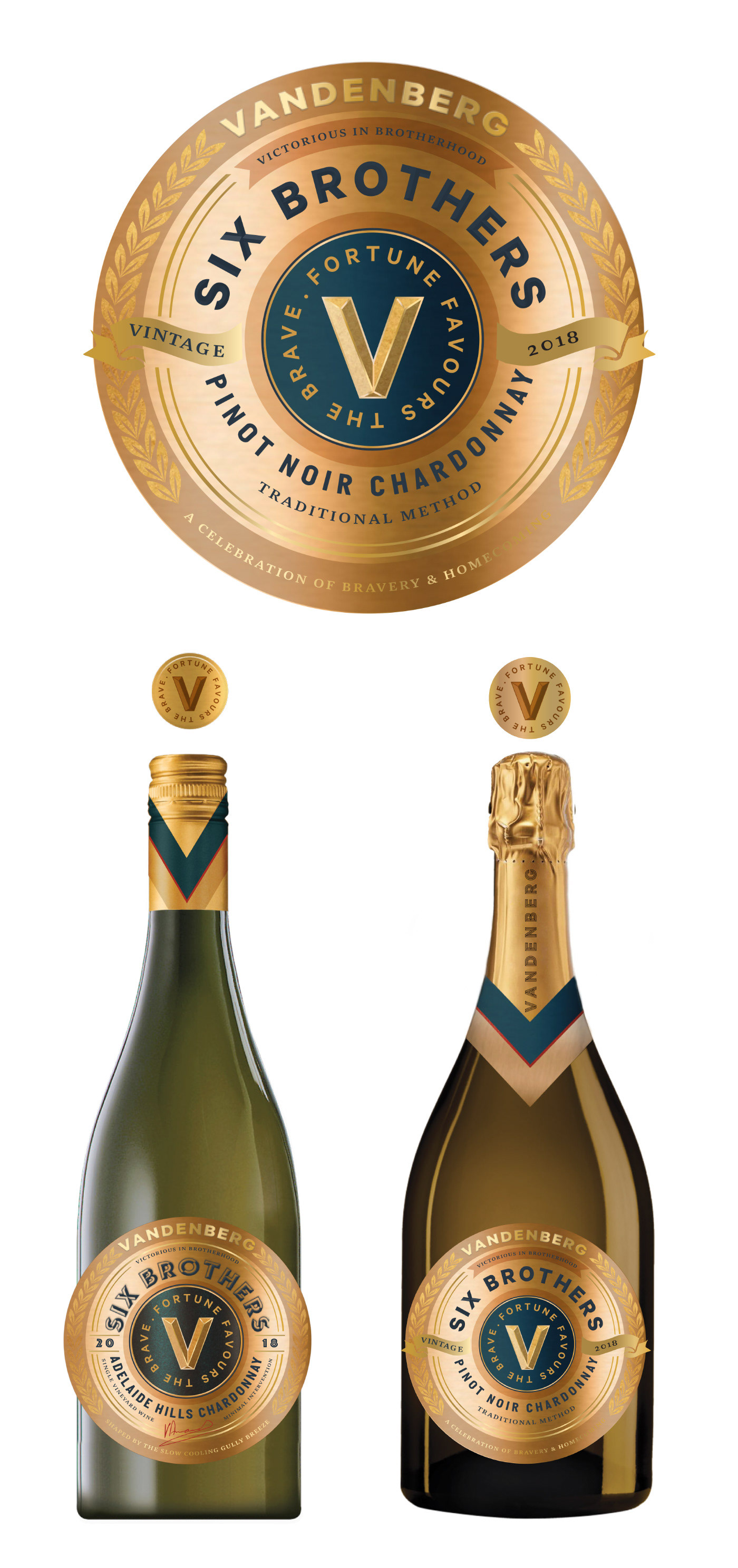
1 Sparkling label design and 3 still label variants.
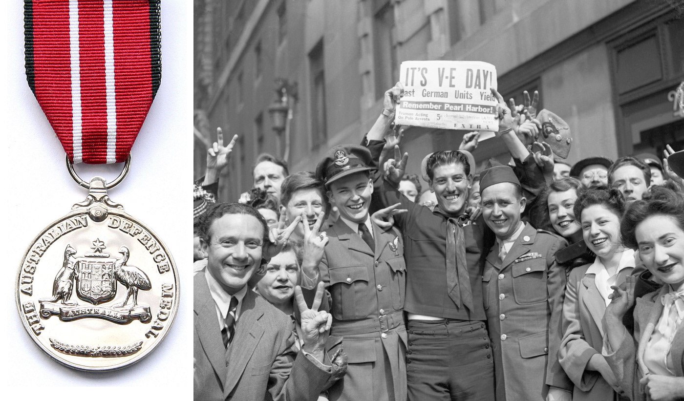
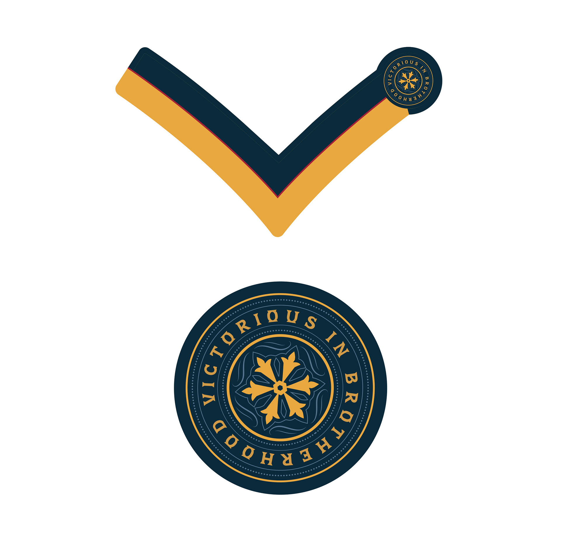
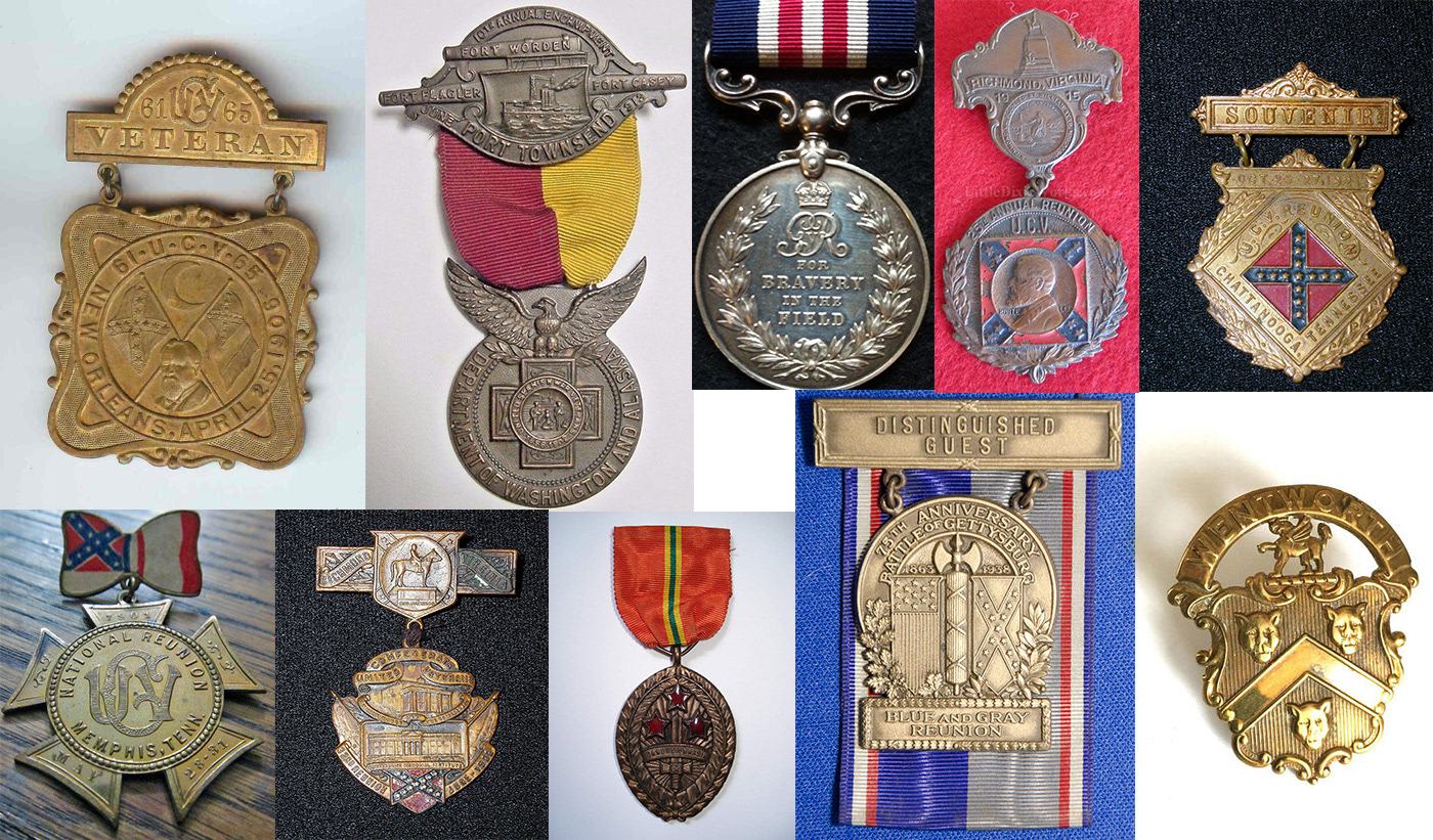
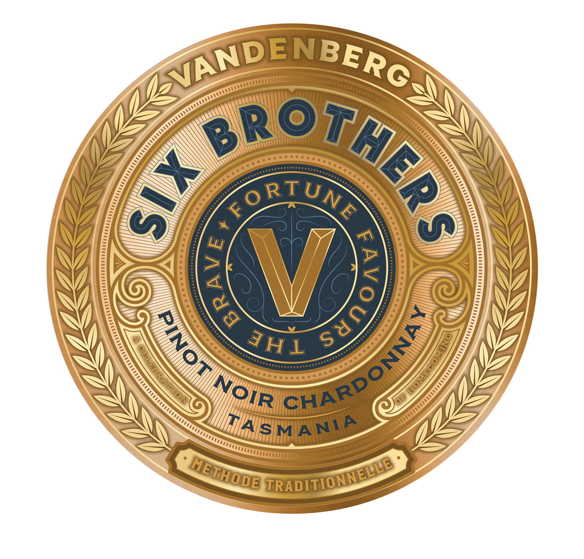
Medal style examples used for inspiration
Co-Partnership approached me as always with a well-ironed-out concept for the project, with strategy and branding all well-considered to link back into the existing brand's guidelines and assets.
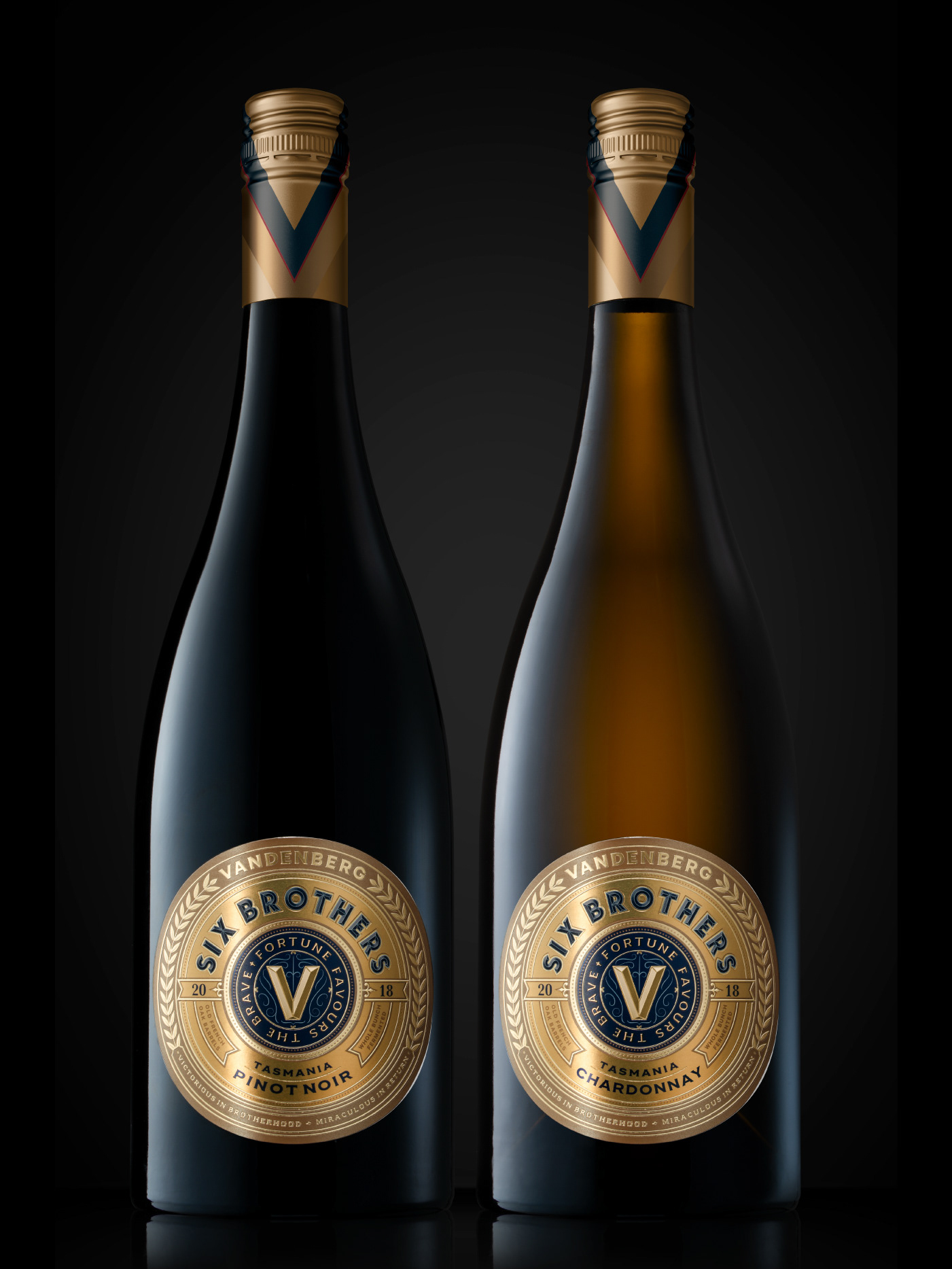
My job was to bring a well-considered crafted aesthetic to the overall design and layout while developing 2 distinct styles, 1 for the sparkling range (more premium feel) and 1 for the still range.
Many versions and ideas were developed for both these designs and the result was a unified design that clearly showed the history and legacy that the brand embodies.
Pinot noir chardonnay - Methode Traditionnelle
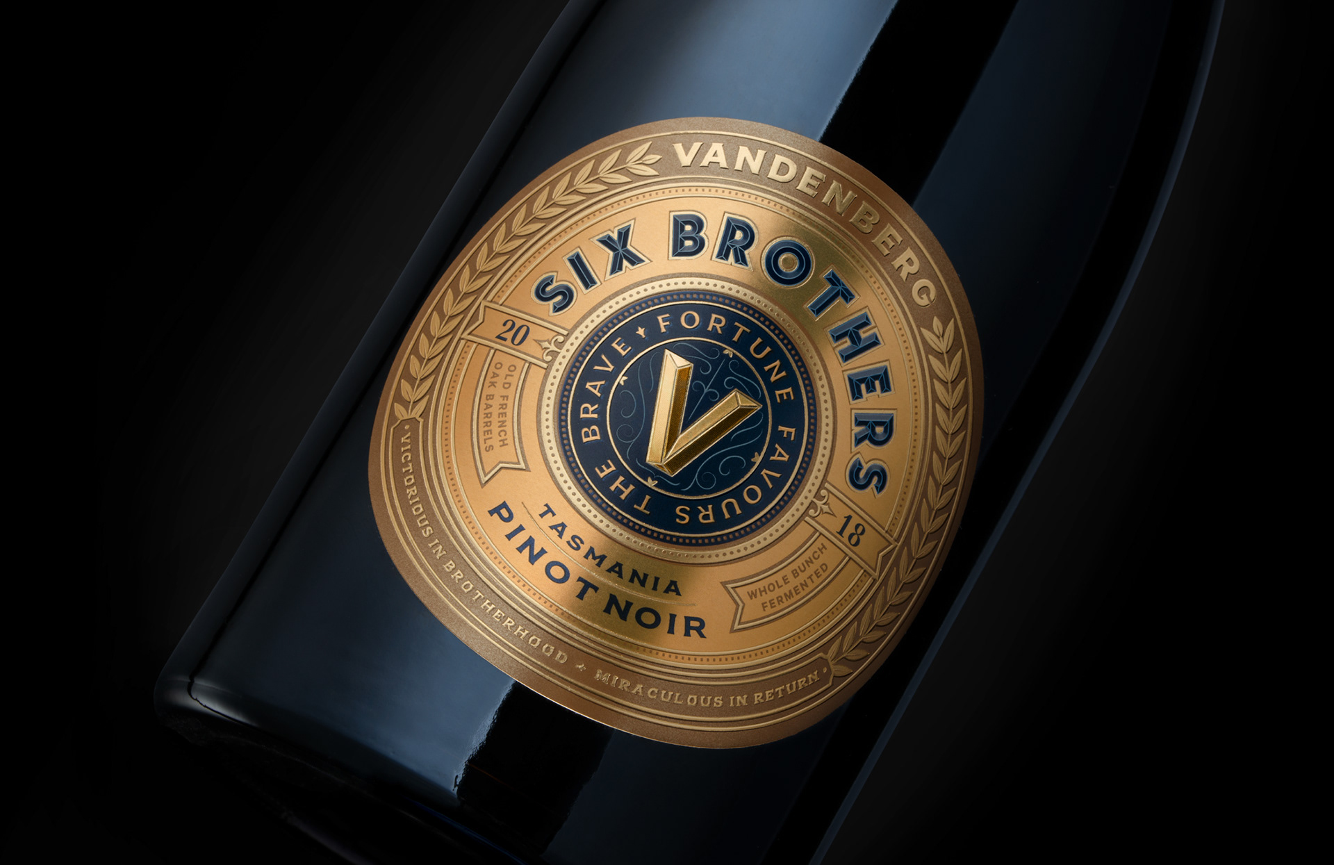
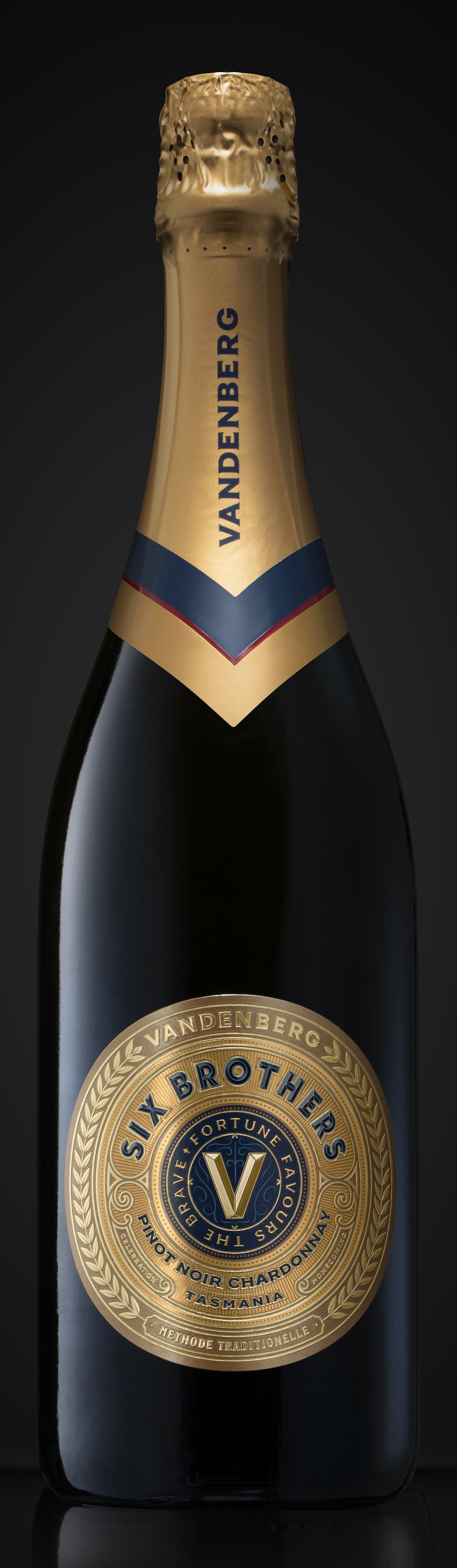
Final design mock-up
Still range of 3 variants.
Final design mock-ups
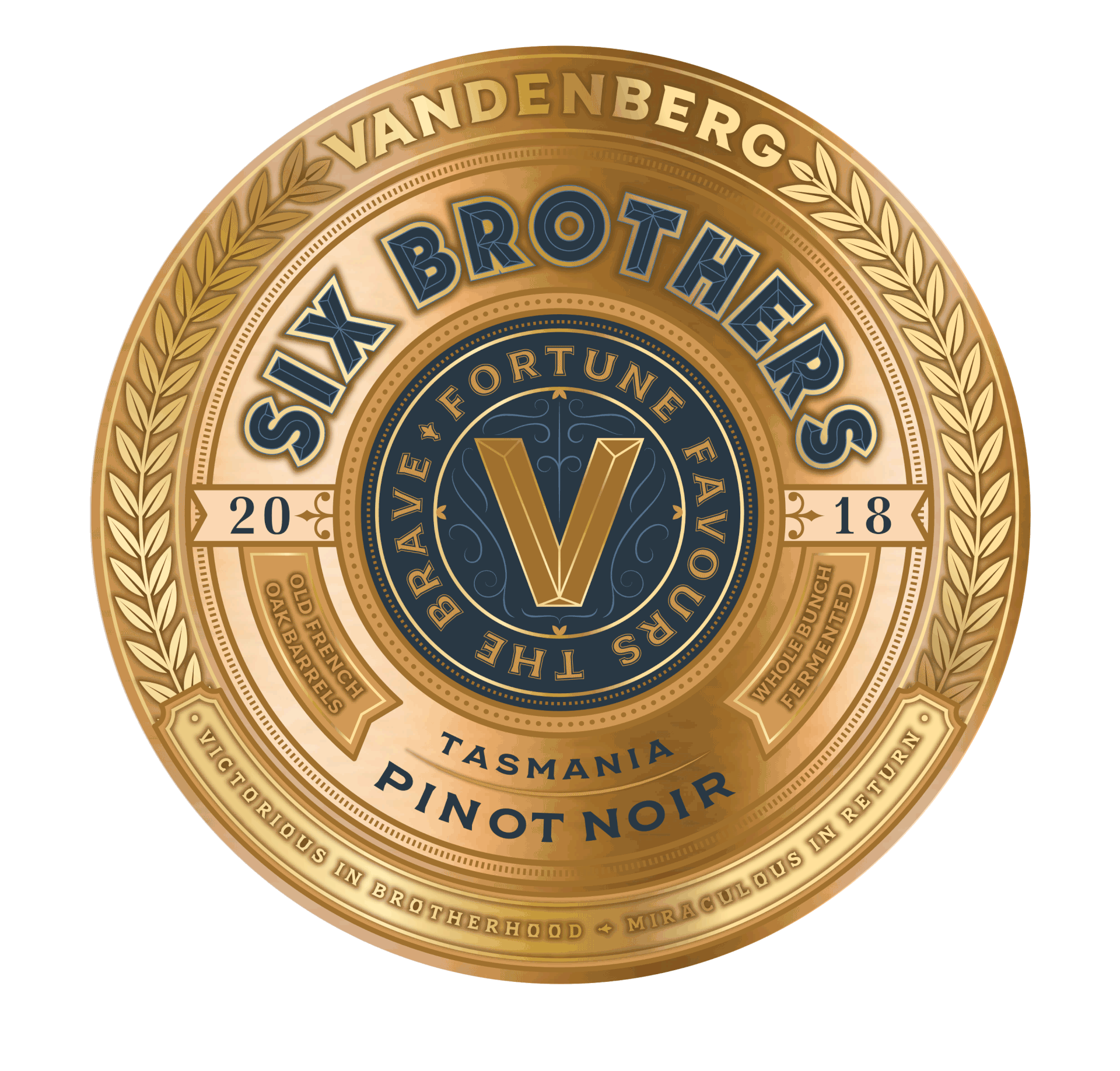
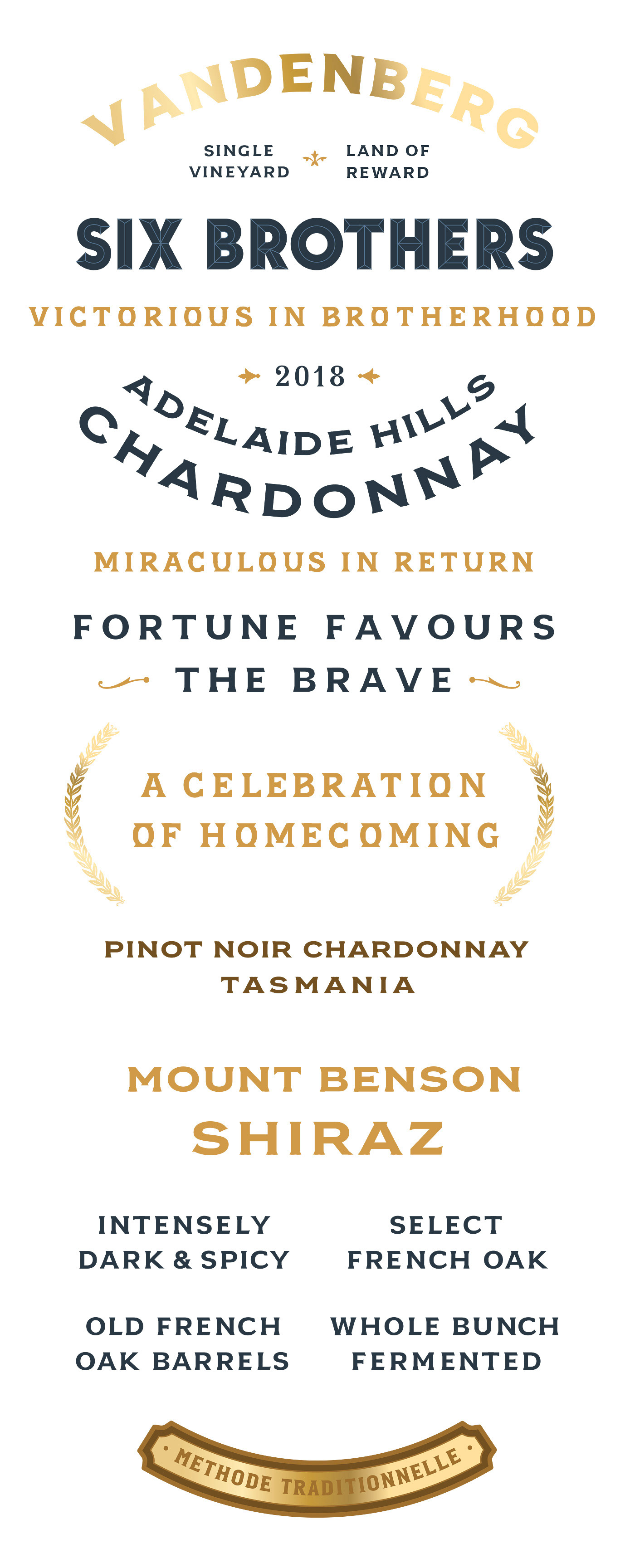
The typography used for the still and sparkling range is all custom-made and
meant to look like the typography you would find on medals from the war era.
Simplicity and authenticity were the aim.
Neck label design