Work
About
Services
Contact
Work
About
Services
Contact
WWD Magazine
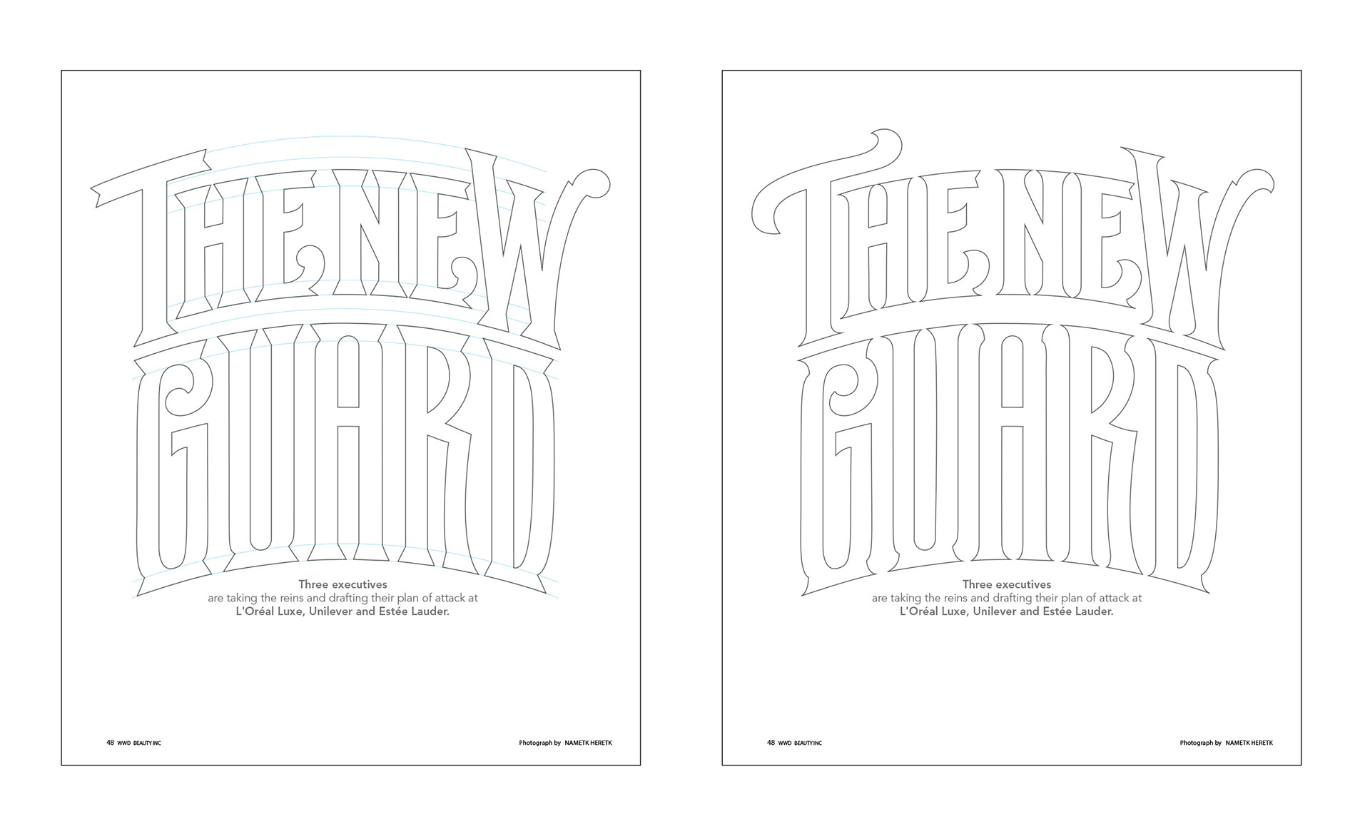
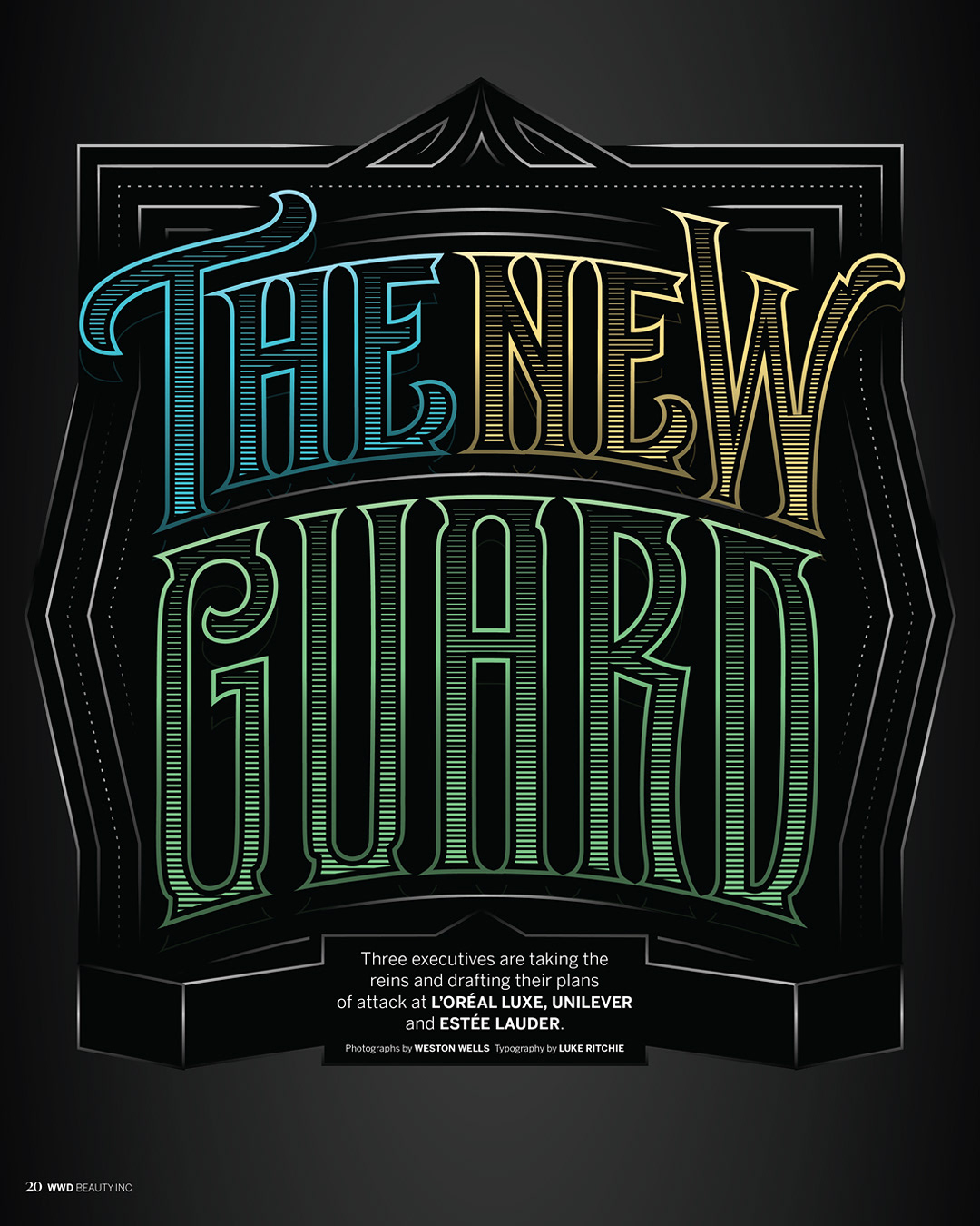
Type design & drop caps for a feature article in WWD Magazine.
Client: WWD Magazine
Category: Lettering, Type Design
↑
Back to Top